

I have been working on my Delilah Four Patch Star by Jen Kingwell. The fabrics I received in the mail were bold and beautiful:)

I decided to experiment with color this month. All of my instincts wanted me to stick with a normal Jen Kingwell pallet.
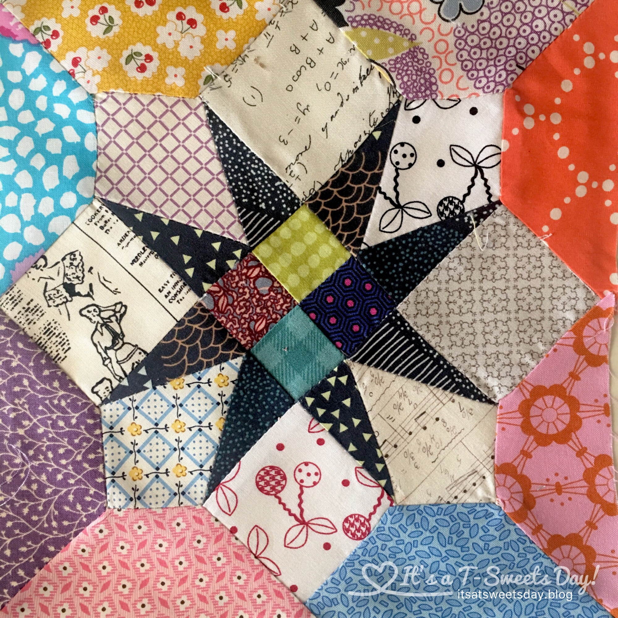
Isn’t it pretty? But for some reason I decided to play with color, and see what happens. It is really amazing to me how color placement can alter the look of a block.
Look at these four blocks. 
Can you believe they are the all the same pattern? The striped fabric in the star made it disappear. Lesson learned—don’t use striped or large prints for small stars.
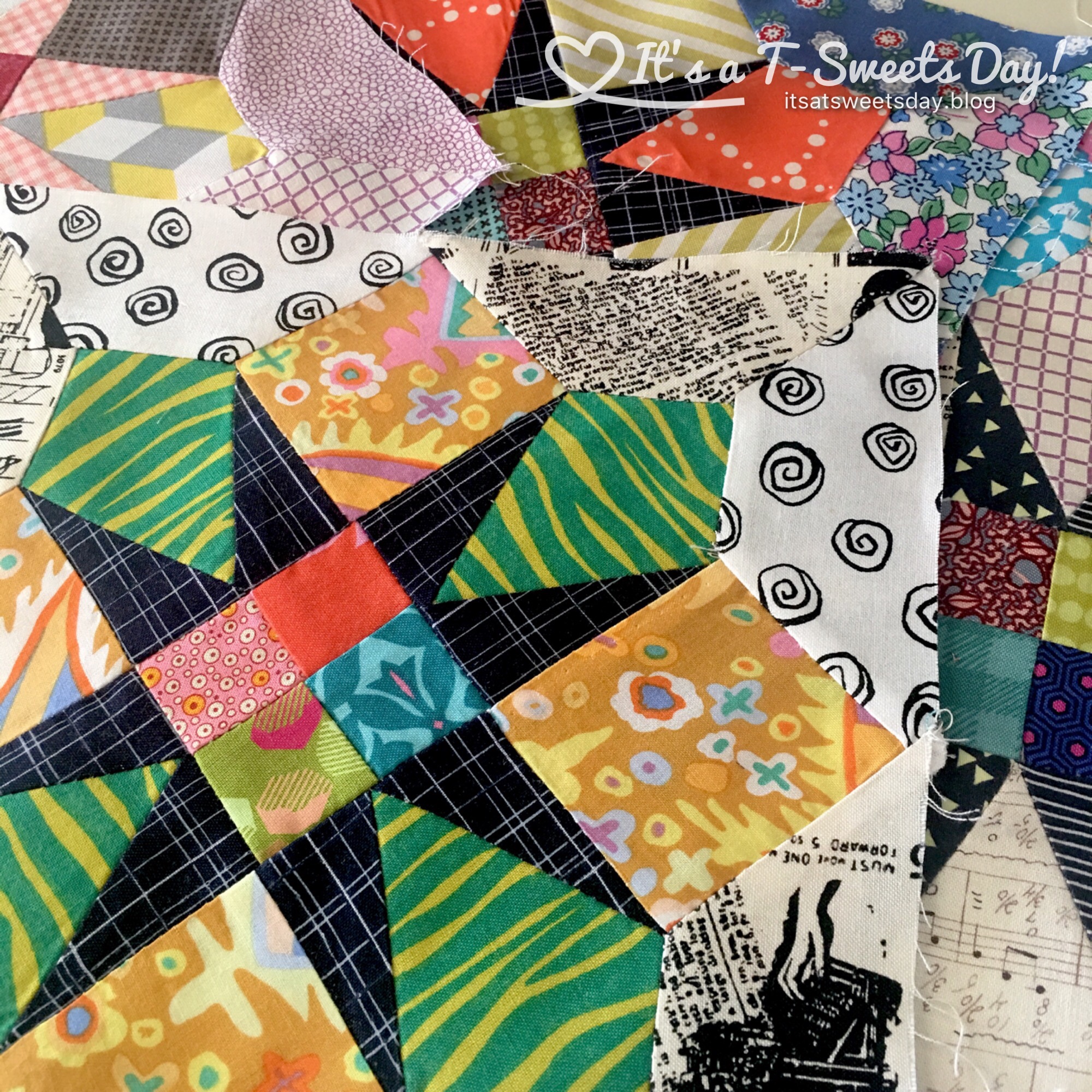
Here are four more stars in softer tones

The contrast of the dark star compared to the lighter backing really makes the star pop. While the pink star on the bottom right is totally lost. It looks like an x.
Crazy right? I really like all of my four Patch stars, but my original is my favorite followed by this pretty orange and blue one

I am having sew much fun making these template blocks that look like paper piecing. But I must admit that I am getting tired of Y seams. I look forward to next month because it looks like only straight joins are in the forecast. Yea!!
The quilt party for Delilah is closed for this year, but there will be a pattern coming out next year if you want to make your own.
Thank you for stopping by and reading my blog. You make my day SWEET!


I have to say, I *really* like the brights on a dark background, but I do see they’re not in the usual palette. I’ve always loved black in quilts, and I like how powerful it makes different elements in those blocks. Lovely!
LikeLiked by 1 person
I think we have similar tastes in fabric Kate:). I really like black in quilts too. Turn up the volume is what I say!😊
LikeLike
Exactly!
LikeLike
I think that # 1 and 3 are my favorites. I like that golden plaid with the black, and #3 makes me think of kites flying! I don’t often think of using black and it is very striking!
LikeLiked by 1 person
Hi Kathy! I find myself being drawn to quilts with black in them. It’s funny how tastes change throughout the years. I used to like the warm muted tones with brown accents and now I can’t get enough bright color!
LikeLiked by 1 person
It is really interesting how our preferences change over time, wonder if it has anything to do with our seasons of life?
LikeLiked by 1 person
Let’s hope not. That would mean we are getting older and we both know that will never happen:). Lol!
LikeLiked by 1 person
The county 4-H staff were always so young that I just never considered that I was old enough to be their mother until my kids were college! Aging us, NEVER!
LikeLiked by 1 person
I think it looks like you are having fun and that’s what counts. The first one is my absolute favorite! Just love the colors and the way it all fits harmoniously. When you did the other blocks did you take a photo and then look at the photo thru a mono lens? It helps to see if the tones are similar or contrasting.
LikeLiked by 1 person
Hi Cindy! Great idea about the camera and the mono lens. Its funny because I just saw a friend do this yesterday! I am definitely going to give it a try:). Thx!!❤️❤️
LikeLiked by 1 person
I learned about it during Rayna Gillman’s class. 😊
LikeLike
Hmm, I can’t pick a favourite, there are a few here that I really like!
LikeLiked by 1 person
I know what you mean! They are all so different:)
LikeLiked by 1 person
it is amazing how colour & fabric layout totally changes the look of a block ^^
LikeLiked by 1 person
Wow! all your blocks are awesome. I love your bright and cheery fabrics, makes me smile 😀
LikeLiked by 1 person
Aww, thank you Abbie! I love seeing the difference color can make in a block:). They make me smile too:) 😊
LikeLiked by 1 person
It’s amazing how much colour choice changes the look of that block. I couldn’t quite believe it was the same. All of them look amazing though Tracy ❤️
LikeLiked by 1 person
Thank you Emma:). I felt the same way. Color is one of, if not the, hardest part of quilting.
LikeLiked by 1 person
That pink checked disappearing act was the most dramatic loss! Underlines the importance of attending to value as well as color. Stripes (and other prints) give me grief when trying to figure out value. An interesting block to play with color on.
LikeLike